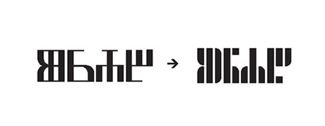
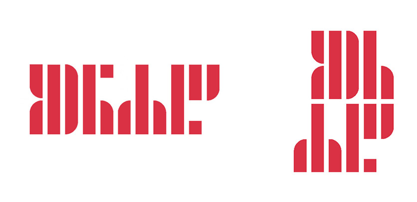
The company’s old logo was based on an ancient
Croatian typeface “glagoljica” spelling out the company name.
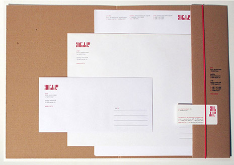
The idea behind the redesign was to preserve the traditional appearance while updating it with a more modern and minimalistic look and feel, making it better suited for an architectural studio.
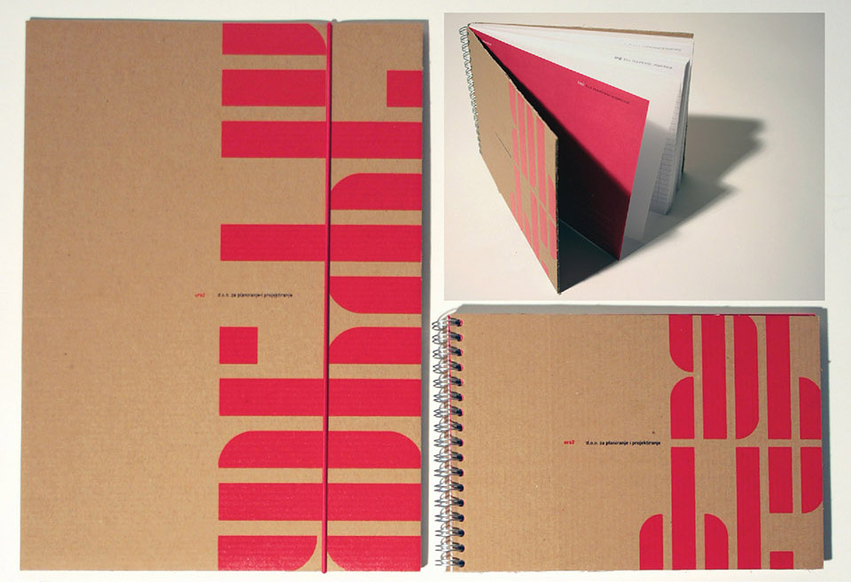
The old logo was simplified and natural materials were used for the stationery to keep the traditional feeling.
The new logo was accompanied by a complex Graphic Standards Manual.
WHILE
@
FREELANCE
2006